INDIGENOUS-THEMED LOGOS HIGHLIGHT CFL’S SUPPORT FOR TRUTH AND RECONCILIATION
Clubs worked with Indigenous artists on commemorative logos
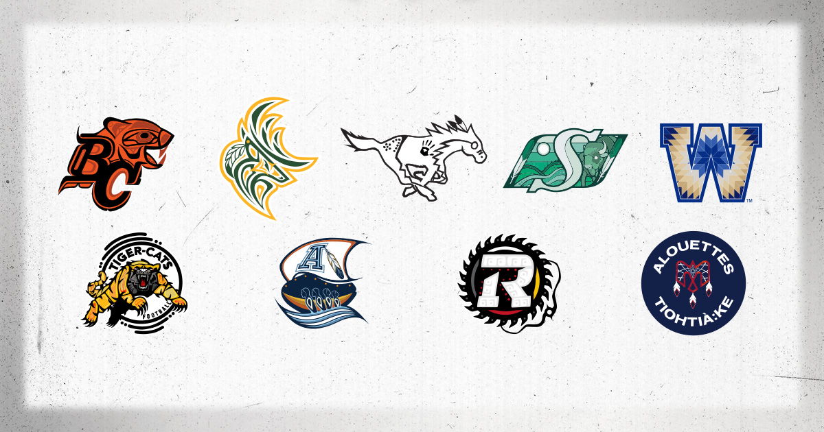
TORONTO (September 23, 2024) – The Canadian Football League’s (CFL) nine member clubs will proudly wear Indigenous-designed logos to commemorate the National Day for Truth and Reconciliation during its Week 17 slate of games. The Calgary Stampeders, who will be on a bye week, featured their commemorative logo in Week 15 when playing host to Montreal.
The logos were created by local Indigenous artists to honour the game’s close ties with Indigenous communities across the country, and to underscore the league’s commitment to recognizing the past, while focusing on a path forward centred on awareness, education and action. The logos will be featured on players’ helmets, in-stadium programming, and on the broadcasts on CTV, TSN, RDS, CFL+ and CBS Sports Network. A portion of proceeds from all associated merchandise sold will be donated to support local Indigenous groups, organizations or programming.
WEEK 17 CANADIAN BROADCAST SCHEDULE
- Fri., Sept. 27 at 8 p.m. ET | EDM at WPG | TSN
- Fri., Sept. 27 at 10:30 p.m. ET | HAM at BC | TSN
- Sat., Sept. 28 at 3 p.m. ET | OTT at SSK | CTV
- Sat., Sept. 28 at 7 p.m. ET | MTL at TOR | TSN, RDS
INDIGENOUS-THEMED LOGOS
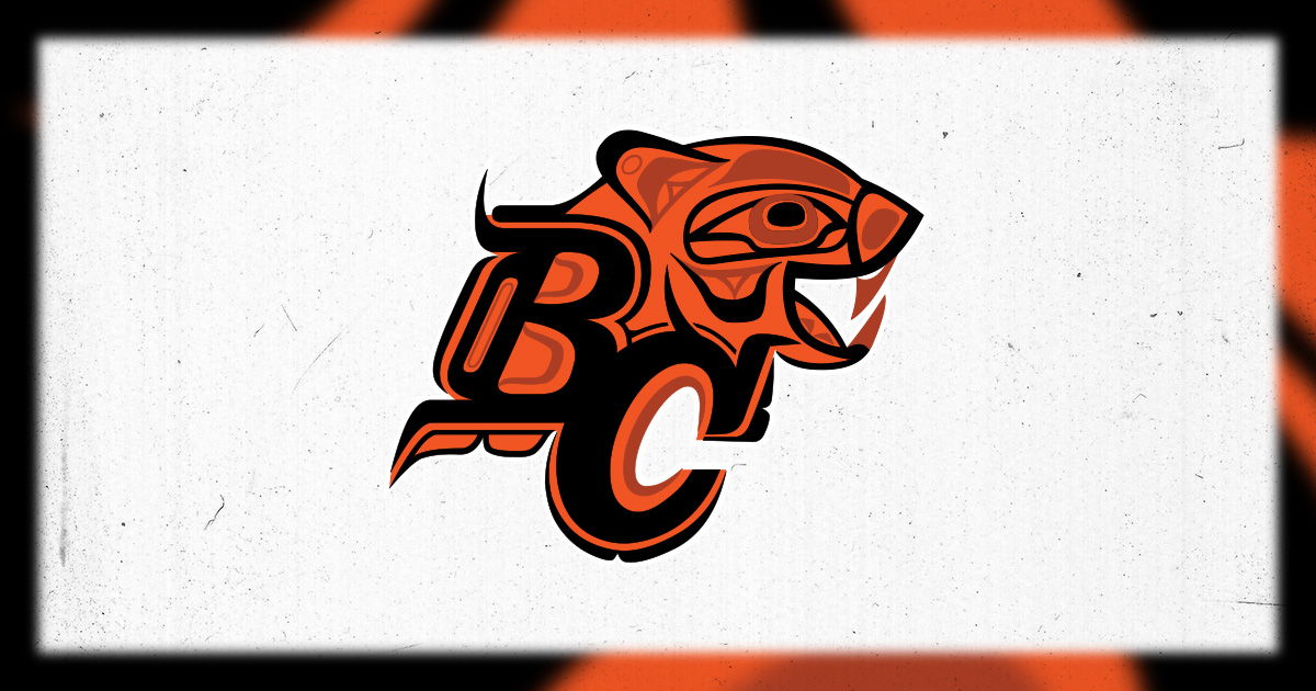
- Artist: Corrine Hunt
- Kwakwaka’wakw/Tlingit
- The design is a stylized rendition of the Lions’ primary logo. It brings to the forefront the Indigeneity of BC through an unmistakably Indigenous art style. It is meant to evoke strength and unity among all those wearing the design, creating a shared sense of kindness, caring and collective energy.
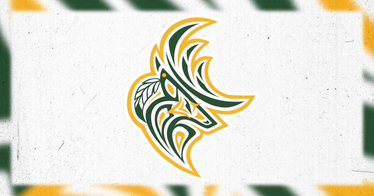
- Artist: Conrad Plews
- Métis
- The logo was inspired by Izaiah Masuskapoe’s Elks logo design in 2021, and blends it with the primary design elements of the Elks’ logo. It integrates both, while infusing elements of dynamic energy and strength. The design is distinctly rooted in the style of Indigenous art to make clear its source of inspiration.
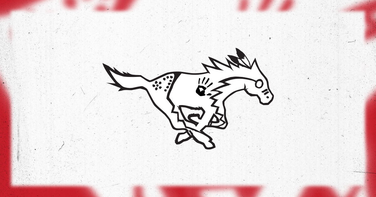
- Artist: Jacob Alexis, Richard Running Rabbit and Dr. Tyler White
- Siksika
- The logo was designed to emulate Contemporary Plains Style Traditional Art. It features the Stampeders’ iconic white horse adorned with paint styles that would be used on special occasions, including when going into battle. The feathers in the mane represent valor or coups. The face is adorned with paint around the eye to represent vision, while the stripes indicate acts of valor. The handprint on the chest represents a fierce horse, and the lightning bolts bring to mind speed and agility. The spotted hind quarter represents creation stories and teachings.
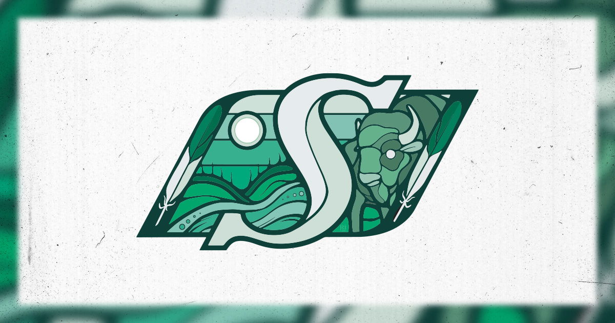
- Artist: Chris Chipak
- Red Pheasant Cree Nation (Treaty 6)
- The artist was inspired by the Treaty 4 flag to incorporate the Buffalo, which embodies the spirit of the Saskatchewan prairies and represents the respect for the willingness to offer every part of itself to sustain the lives of others. A connection between the land and the people. The sun emphasizes the Treaty promise and it signifies the interconnectedness of all things to represent the collective effort that is essential to reconciliation. The ribbon-like skyline pays tribute to the province’s identity as "the land of the living skies" and traditional ribbon skirts. The river’s (kisiskaciwan) eight circles symbolize the number of native berries of Saskatchewan. The two upright feathers evoke a sense of respect and honour, while representing Two-Spirited people, acknowledging their roles as guides and their diverse perspectives within the community.
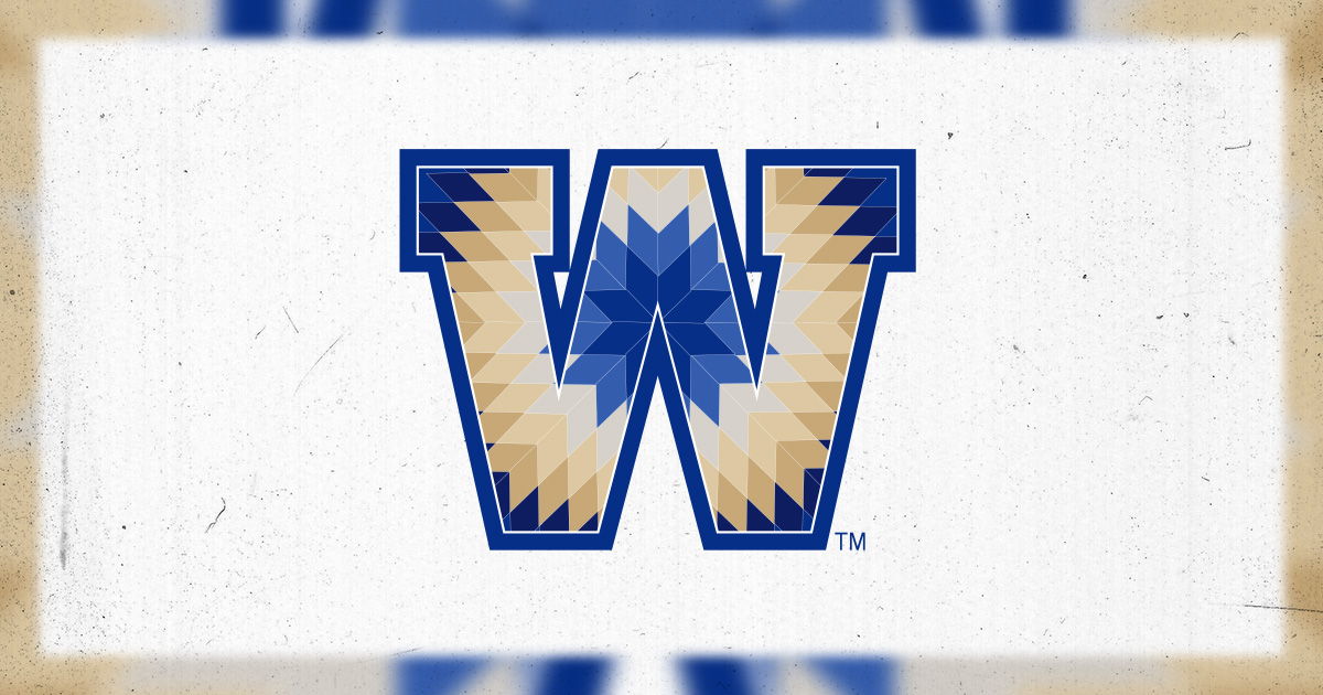
- Artist: Dené Sinclair
- Peguis First Nation
- The design is indicative of the star blanket in the First Nations and Métis traditions, which is gifted to leaders in a community and wrapped around their shoulders in ceremonies. A typical design includes diamond shapes of varying sizes combined into a geometrically-even, and often eight-pointed, star. The star blanket recognizes an individual’s efforts to forge a safe, balanced and warm path ahead for a community, while bringing light in the darkest of times, symbolized by the morning star at the centre of the design.
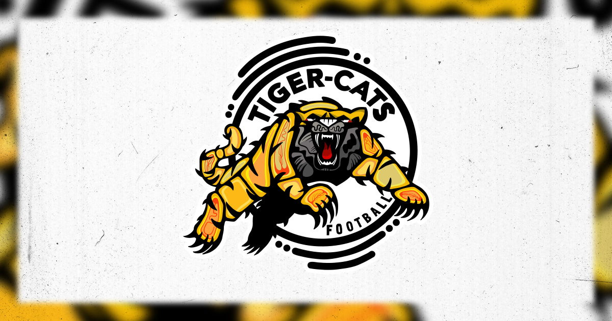
- Artist: Kyle Joedicke
- Cayuga from Six Nations of the Grand River, Turtle Clan
- The logo preserves the primary design elements of the Tiger-Cats to remain true to the city and the team, but every part has been carefully re-imagined to incorporate a style that is immediately recognizable as Indigenous. The incorporation of Indigenous art with the traditional look and feel of the team demonstrates that Indigenous peoples are a distinct part of Hamilton’s sporting community and the city itself.
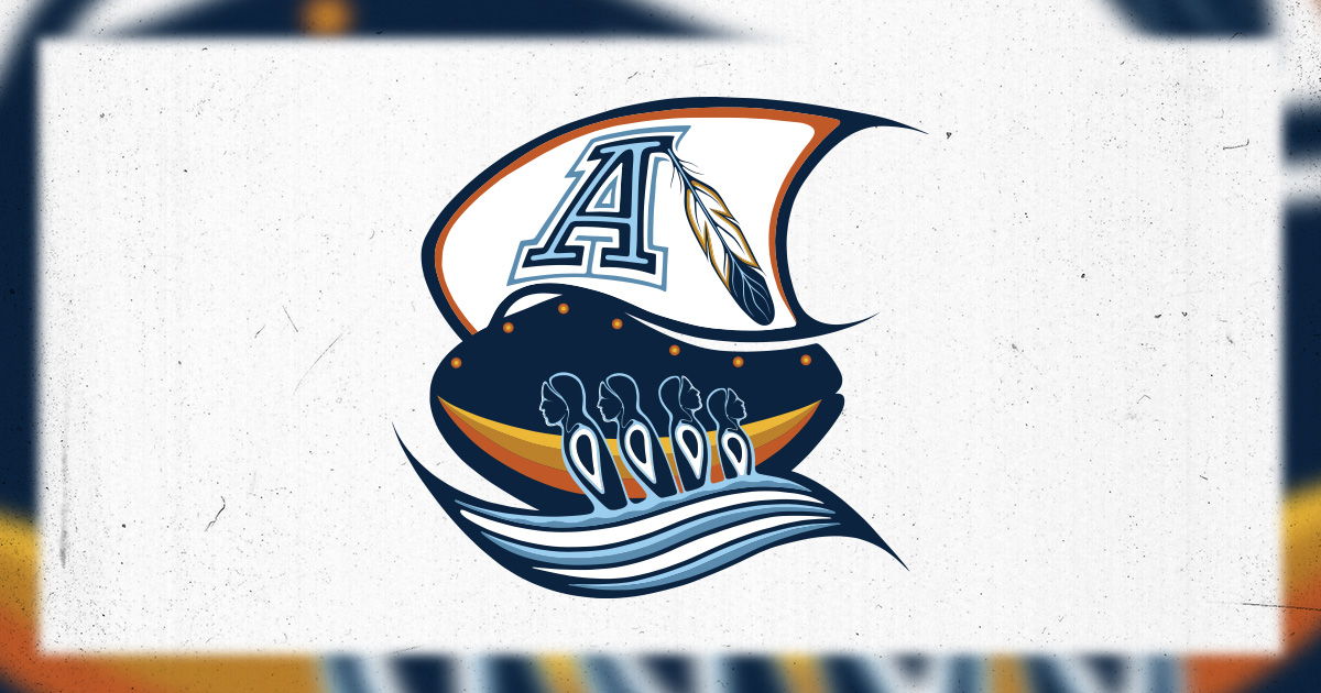
- Artist: Emily Kewageshig
- Saugeen First Nation No. 29
- The focus lies in the figures that emerge from the water, representing all Indigenous peoples, as well as a close connection with water itself as a symbol of life. The number of figures references the four directions of the medicine wheel. Within each figure is an opening created in place of their hearts to symbolize the people of the Anishinaabe Kwe, Saugeen Ojibwe Nation, being known as the ‘good-hearted’. The seven circles across the ship reference the belief that decisions should be made with the next seven generations in mind to promote sustainable and healthy futures. The feather represents honour, strength and bravery. The use of the orange gradient evokes the sun rising and setting, and the opportunity to make each day better than the last.
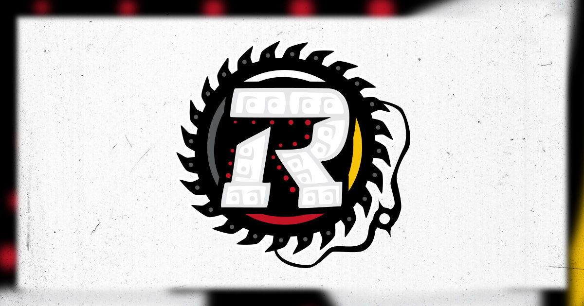
- Artist: Mike Ivall
- Chippewas of Georgina Island
- The logo features the white, yellow, red and black medicine wheel that has been used for generations to symbolize health and healing, as well as direction, unity, elements of culture, and all races. A second significant element is the stylized squiggling line in the bottom-right corner, that serves as an homage to the Creator. The design is rooted in the spirit of connection and togetherness.
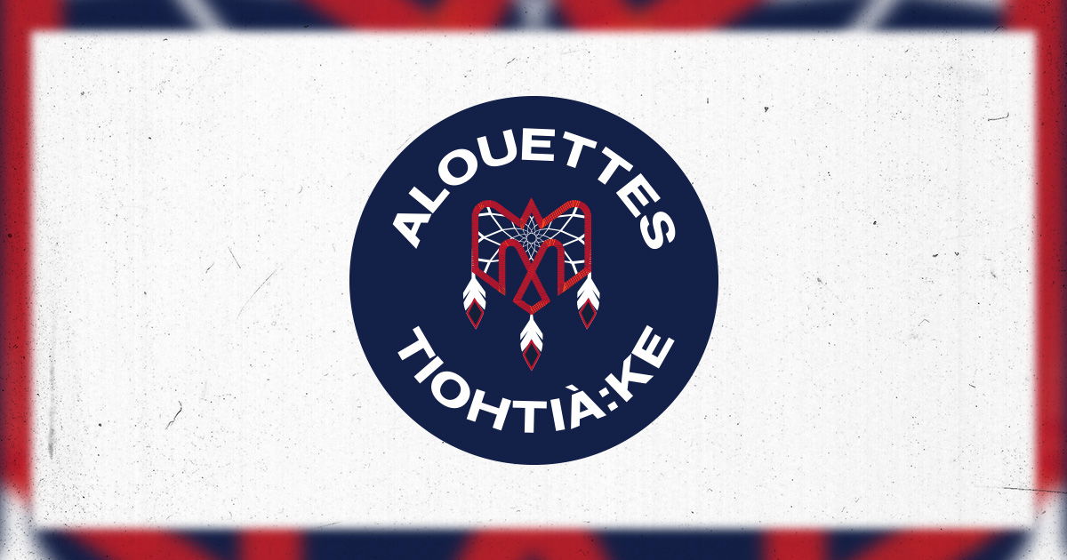
- Artist: Finnley Montour
- Kahnawake
- The Kanien'kehá:ka (Mohawk People) are the custodians of the land now called Montreal, or traditionally, Tiohtià:ke. The use of two languages represents the spirit of collaboration, with which the logo was created. The three feathers are indicative of the traditional headdress worn by the Mohawks, and the dream catcher webbing features star-style shapes with the 12 points serving as a nod to the dozen players on the field.
